Tuesday 21 March 2017

MID-CENTURY LIVING SPACE IN THE HEART OF THE CITY


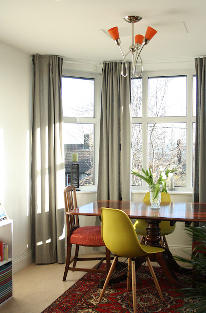
It really doesn't get any better than when a client tells you their preferred style is the same as yours. Working on this living and dining space was my first official project and it will be a hard one to beat. The couple (and their little boy) live in the heart of Cork with beautiful views overlooking the city and beyond. Most of the landmarks can be seen just sitting at their dining table so my first goal for this transformation was to really make this view part of their space. 
The second goal was to brighten up the space while keeping it warm and homely. 
The last goal was to create clear designated areas in the large space for relaxing, reading, playing and dining.


I achieved the first goal by replacing the heavy roman blinds in the bay window with light full length curtains, making sure the curtain poles were placed a little higher than usual to maximise the light. 


Brightening up the space was an easy task - changing the wall and ceiling colour instantly lightened the space. Keeping it warm and homely was achieved with the addition of some greenery, warm wood tones and colourful accessories. 


Creating clear designated areas was resolved by arranging new and existing furniture correctly as well as removing some pieces that were clogging up the space and restricting the traffic flow in the room. 

Between sourcing vintage pieces, choosing bright, vivid colours and even a bit of upcycling - it really was a pleasure to work on.

Cathy

Monday 27 February 2017

GALLERY WALL TIPS

Gallery walls are a great way to introduce art and memories into your space. There's no real hard and fast rules for displaying your gallery wall (it can be as quiet or wacky as you want) but I find that a few things really help so that it visually looks well as a whole and works with your space.

photo by Naomi Kamat


Before you start hammering your picture hooks into your plaster, lay out all your frames, canvases etc on the floor. This gives you a chance to play around with the layout and choose the best option for your display. Take a photo of your final idea and this will be your guide for when you're placing them on the wall. 


I'm an eclectic gal but I do find that most gallery walls, whatever your style, look better with a bit of variety going on. Instead of sticking to just one type, mix it up a little. Or a lot! New frames, old frames, canvases, wall hanging, embroidery hoops...if you can hang it up, you can add it in!


If you are going for a slightly varied gallery wall, do try to keep a bit of order. One of the best ways I find to achieve this is to have equal spacing in between each piece. I usually judge this by eye so it's never exact but it does help to make the gallery wall as a whole look more cohesive. 


Cathy x

Wednesday 15 February 2017

GREEN VELVET


images via pinterest 

Maybe it's the fact that Greenery is the colour of the year but right now, I'm dreaming and drooling over green velvet sofas. 

Cathy x

Monday 6 February 2017

NEW TO IKEA


As part of their PS 2017 Collection, Ikea have a new kitchen design and I gotta say, it's a big thumbs up from me. The cabinet doors are made from recycled plastic bottles and reclaimed industrial wood. I just love the slick design and the matte finish. I don't think I've seen recycled design look so sexy!
Also part of the collection is the 3D knitted chair as seen below. A soft mesh fabric stretched across a steel frame to create a sophisticated yet simple design. Another road trip to Ikea will be on the cards soon...


Cathy x

Tuesday 31 January 2017

MIRROR MIRROR ON THE WALL


Another major crush I have is on the old bevelled edge mirrors from the early 20th century. My own one, pictured above, hangs proudly in our bathroom and was a gift from my aunt and it originally belonged to her mother. I love the frameless detail and I especially love it's fan shape which gives it it's unique Art Deco style.


If you're not lucky enough to find one at a vintage flea market or secondhand shop, you can find a few replicas like this one from Debenhams and this one from Laura Ashley. 

Cathy x

Thursday 26 January 2017

PAINT OF INTEREST


I'm all about colour. Even the "boring" ones like grey, beige, even good ol' greige! If I am going for a classic, no-surprises kinda colour palette, I love the idea of throwing in a few surprises and pops of colour in places that are not traditionally meant to stand out or be accentuated. 


DOORS & TRIMS


Sticking with the same colour as your walls for your doors, frames and skirting boards creates a calm and seamless look but adding a bold colour to these features makes the space more interesting and can highlight beautiful panelling of a door or decorative moulding on a frame.


ARCHWAYS & ENTRANCEWAYS 


Add a pop of colour to archways or interior entranceways can make these subtle features really stand out especially if painted a darker or bolder shade. 

WINDOW FRAMES & LEDGES


Painting the frame, ledge and recess of a window a contrasting colour can really add to a space as well as draw your eye to the view outside. Don't be afraid to go for something unique (bright primary colours if they'll work with the rest of your space) but even black can do the same job just in a more sophisticated way. 


Cathy x

Monday 23 January 2017

DESIGNED AROUND A RUG

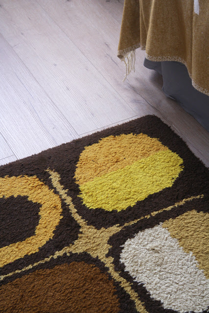
 This rug was made by my late uncle when he was just a teenager. It would have been in the 1960's and as you can see, it's a quintessential sixties mod style pattern and even the colours stay true to the decade. I've had this rug in our new home for the past year but hadn't found a place for it until we decided to tackle the spare bedroom. 
This rug became the inspiration for the room's decor. From the colour palette to the style, I wanted to design the room all around the rug. 
I'm a big fan of mustard and grey combo so when I decided on a half painted wall, I knew instantly, that a warm grey would work best here. As the room isn't very big, the half painted walls along with the curtains hung quite high give the illusion of a higher ceiling and more space. 


 Cathy x